Tuesday, 8 January 2008

- eBoy


eBoy ("Godfathers of Pixel") is a pixel art group
 founded in 1998 by Steffen Sauerteig, Svend Smital, Kai Vermehr. Based in Berlin, eBoy's founders collaborate with Peter Stemmler in New York to produce graphic design work for companies.

Their work makes intense use of popular cul
ture and commercial icons, and their style is presented in three-dimensional isometric illustrations filled with robots, cars, guns and girls. Their unique style has gained them a cult following among graphic designers worldwide[citation needed], as well as a long list of commercial clients.
eBoy has worked with named brands and companies such as Coca-Cola, MTV, VH1, Adidas, and Honda. They have also worked in creating the album cover for Groove Armada's 2007 studio album Soundboy Rock.

I feel the tediousness of this design when viewing it, feels like it must be a painstakingly boring task, but Is very visually a
ppealing to me. Reminds me very much of pop art! I like the development process, how they've started with small charecters and moved on to developing entire cities.

- James Jarvis Illustrator 1970-


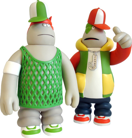
Inspired by classic cartoons like Tintin and Popeye, the British illustrator JAMES JARVIS (1970-) has created his own three-dimensional casts of characters as the World of Pain and In-Crowd plastic toys. He also invents imaginary worlds for his characters each of whom has their own role and personality.

When James Jarvis dreamed up a group of bikers as a new collection of the plastic In-Crowd characters he designs for the toy company Amos, he pictured them as “reasonable, sound, sane, wise, balanced, rational, sagacious, prudent, judicious and level-headed”. He even invented a club for these do-gooding bikers – the Forever Sensible Motorcycle Club.

Jarvis went on to study illustration at the University of Brighton and then at the Royal College of Art in London.

A Japanese friend suggested that Jarvis should turn the characters drawn in simple, sparing strokes in his illustrations into toys which he did by creating the engagingly raffish Martin, a moulded plastic model, for the London-based fashion company Silas. Jarvis then developed equally engaging characters to live with Martin in the World of Pain, the imaginary world inspired by Tolkien’s Lord of the Rings which he invented for them and depicted in a book and website. Eager to create different characters, who would not necessarily fit in to the World of Pain, he then invented the In-Crowd series of figures.

I really like this kind of work, although I could not see it as something I'd do myself I find it really interesting and love the quality of his works. They're very bold and clear and remind me of Wolice and Gromit style characters. 


Heroes & Heroines

We look to our peers for both inspiration and to drive us to reach for higher creative goals within our design careers.

Friday, 26 October 2007

Seeing in black and white

After giving this subject some thought my initial idea was to do something race related, I wanted to challenge peoples opinions and judgements. I wanted to raise the question. Are people judged by colour?

I had ideas such as having a black person in a business suite and a white person in baggy clothing, I also played on the idea of property, placing a skyscraper next to a "hut", I wanted something to make people question their thoughts.

After some discussion with a tutor I decided on the idea of having silhouettes lined up as in a police lineup, but 3 of the silhouettes being standard shapes where as the fourth would be much taller and wearing more "threatening clothes" such as "hoodies" which is big in the media at the moment.


Once taking the idea to the studio I had some major problems at first with lighting, I was trying to make a silhouette figure and I was just getting way too much light on the subject, as you can see in the circled areas above.

I managed to conquer this problem my moving the model, positioning him further away from the background..


I was impressed with this picture, as I didn't think I'de get such a quality picture.
This made it alot easier for me once taking it to photoshop.

My initial piece was as follows:


I liked this image but my thoughts were that it was rather plain, after discussion with a classmate we both felt the same.

I then decided to add a grunge-style backgroun to enhance the photo, I was pretty pleased with the image and here was my final result:

Juxtaposition Brief

This is the first brief I have been given on my course, It's all about image manipulation and image editting.

We've been given 3 phrases which the images must represent:

Seeing in black and white
Blowing hot and cold
Silence is deafening

to start work on this project we started brainstorming using a technique we'd previously learned "Mindmapping".

Tuesday, 9 October 2007

1. NWSAD


This is the first entry into my blog, this blog will track my progress on my FdA Digital Media course at the North Wales School of Art & Design.